Sunday 5 May 2013

Film Pitch

Title - Paths

Genre - Urban Drama


Time Period - Contemporary


Location(s) - South London (Tooting, Purley Way and Brixton)


Budget - Low


Target Market/Key Demographic - Teens 16+


Logline - This films falls into the genre of urban thrillers as it is set in London's council estates. Two boys who are roughly the same age yet different in many ways meet in conflict.


Treatment - There are two characters that are at conflict with each other of the death of one's brother, the boys are two different people in terms of their look on life, one is trying to leave the hardship of living  on estates and focus on his school work. Whilst the other is a gang leader involved in criminal activity, the two's path cross when the younger brother of the gang leader was involved in an accident which resulted in his death, this was caused by the second character accidently when driving his car. after much bullying received from the gang the two finally meet on a road to settle their difference.

Saturday 20 April 2013

Evaluation

In what ways does your media product use, develop or challenge forms of media & conventions of real media products?

Our teaser trailer breaks codes and conventions of many urban thrillers. Our main influences were movies like KidultHood, Bullet Boy and Ill Manors. One of the main convention we broke was with our character casting. We had an Asian protagonist (me), which is something you don't see often in urban thrillers, the only movie in that genre that had a Asian protagonist was Ill Manors and Shifty, in both movies was played by Riz Ahmed played one of if not the main character. Majority of the urban thrillers that you see have predominantly African Caribbean ethnicity, such as Noel Clarke and Ashley Walters.
Our mise-en-scene was very conventional to the urban thriller genre, our characters where wearing black hoodies, tracksuits, casual trainers. This is very stereotypical view on the teenagers of London today and also characters in Urban Thrillers. Our setting was in both Brixton and Tooting. We decided to set our trailer there because these areas would be very familiar to our key demographic, as the majority of them would be from in and around London.


How effective is the combination of your main product and ancillary text?

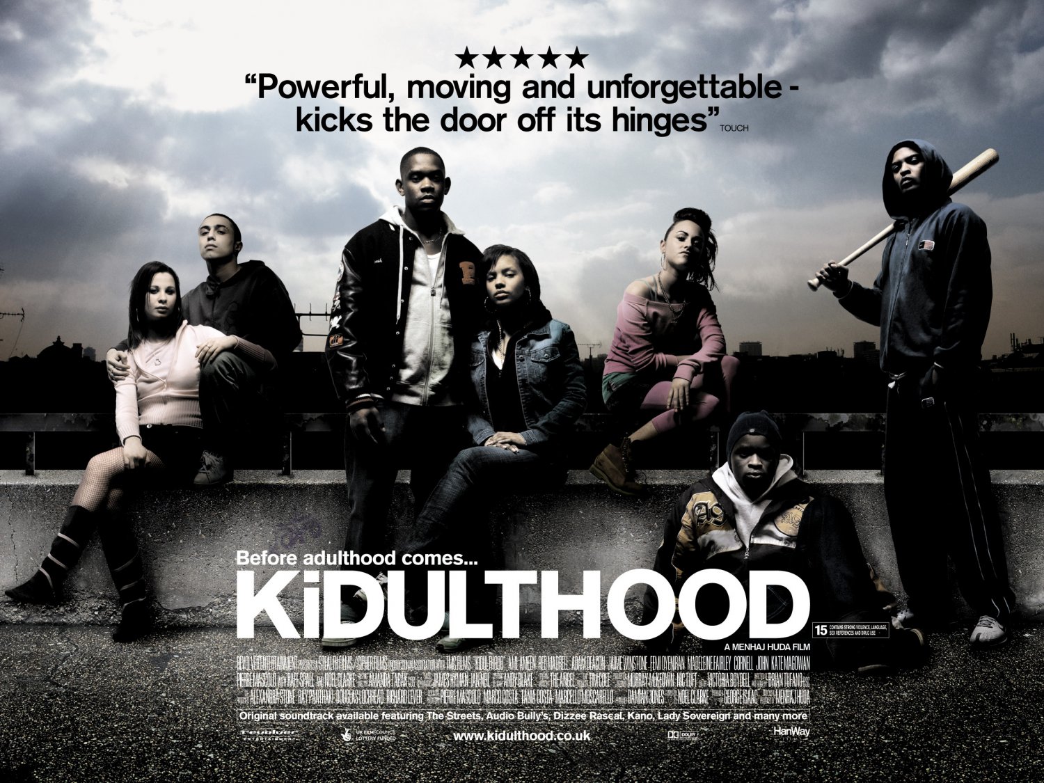
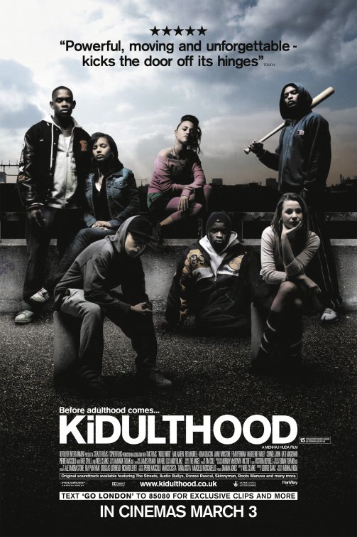
Our teaser trailer works will with our ancillary text (film poster and magazine cover), as they all convey the theme of our film. Our film poster hasn't got a lot of colour as it is very dark, we got our influence from the Kidulthood poster. it has all the main characters lined up against a wall, the colour seems like the picture was taken at dusk. The colour scheme of the KidultHood poster is very dark bluish as is very similar to our film poster. Another influence is the background, in the KidultHood poster has vague resemblance of a run down estates, our film poster is the blocks on Brixton. Our magazine cover has Ainsley in his costume, with a background of city behind him, this represents the character's dream as he wants to leave the hood and enter the city. I think it works well, especially the magazine cover as it sticks to its conventions, as it mostly focuses on one character. If you see our teaser trailer and then see our magazine cover, you will be able to understand each bit to our poster.


Audience Feedback...

Our audience was what we expected. Many people liked our teaser trailer, but we expected the audience to be confused by who the bad person and the good person is. We did this deliberately so that the audience think that both characters are the bad guys, however, when they go see the film, they'd see that only one is and the other is trying to change. Majority said that they liked how 'its set in area's in which we call all relate', we were trying to reach out to the youths of today as this is something that many young boys and girls go through. They like the soundtrack to our teaser trailer as well as it gives an emotional touch to the environment, almost a bond between the characters and their environment. In psychology, psychologist suggests that the environment plays a big part in defining our character.
Regarding our magazine cover and film poster, many people said they both worked well together once I had explained what our film was about and said they would like to look into it. They really liked the setting (the brixton estates), they said how it is very familiar with the youth of today and it 'pays a homage to the past of South London'. They especially liked the magazine cover and how the character of Ainsley position amongst the background of city. 


How did you use media technologies in the construction and research, planning and evaluation phases?

This year we used Final Cut Pro X instead of last years IMovie to edit our film. There were many implications, because it was a brand new software it did take us quite a while to get used to it, this unfortunately did shorten our editing time. However, what we lost in time we made up in the editing stage. Using the Final Cut Pro X did make our movie more professional, for example, by using the blade tool, we were able make it more precise, that was something that we couldn't do last year with IMovie. We were using the same HD Camera as last years but this time we had a mic so our scenes with dialogue could come out clearer, the mic on the camera isn't as good as the mic so the quality sound would not of come out as good. We used PhotoShop to put together our movie poster and magazine cover, we used this because we've used PhotoShop numerous amounts of times before and are very familiar of it, this is also a very good software as a lot of the professionals use this. We were able to make our poster and magazine cover look more professional. We uploaded our movie and audience feedback video on to Youtube, which was the 3rd most widely used search engine, which is even more surprising considering it is a video website and not a search engine.

Thursday 11 April 2013

Our Actors Contract and Shooting Schedule

Actors contract
Our media studies group agree to abide by health and safety rules, not make you do anything you are uncomfortable with and to let you know as soon as possible if any shots are cancelled or are rescheduled.

As an actor/actress, I agree to arrive on time, not to make any commitments on agreed filming dates, listen and act upon the groups directions, act professional and sensible when on set, bring any agreed props and costumes and let any member of the group if there is a problem as soon as possible.

Name (Please Print)................................................
Signed ...................................................

Shooting Schedule
Day
Summary of shot
Location
Props
Character needed
1
Establishing shot
Housing estates of Loughborough
None
None
2
Dolly shot
Main road, Tooting
Car
None
3
Long shot
Side road, Purley
None
Shahrukh
4
Meduim shot
Outside of the housing estate  in Loughborough
None
None
5
Close-up shot
Side road, Purley
None
Shahrukh & Ainsley
6
Dolly shot
Side road, Tooting
Car
Ainsley
7
Superimposed title shot
N/A
N/A
N/A
8
Split screen
       ----
Medium Long shot
Side road of Tooting and Purley
None
Shahrukh & Ainsley
9
Superimposed title shot
N/A
N/A
N/A


This is our shooting schedule, however, in certain days we had make a few changes to the props and may have added a few more shots.


Star Trek, The J.J. Abrams Issue Analysis.

Empire Magazine: #287 (May 2012)
empire jj abrams issue star trek into darkness fold out coverThe new and highly anticipated Star Trek: Into Darkness was the big talk in the most recent Empire issue. This magazine cover breaks the conventions for majority of magazine covers as it opens out to a long poster. 

The magazine cover is entirely based on the Star Trek movie, it has the futuristic city in the background, with the 4 main character in the front. The colour of 'Empire' is a similar if not almost the same colour as Chris Pine's (Who plays Captain Kirk) top. From the magazine cover, the audience can already tell who the good and bad guys are. Benedict Cumberbatch's character John Harris is in very dark lighting and can just about see his facial expression, whereas the other 3 characters you see very clearly.It is very rare that you see a female character on the front cover who isnt a 'damsel in distress'. Also, there are no other promotions for new upcoming films, just a few small mentions of them at the bottom. The main eye-catching text is is the J.J. Abrams in the same colour as the 'Empire'. It is written that this issue of Empire is dedicated to J.J. Abrams, says that 'How a film became the most powerful director in the galaxy'. This is a big claim as it is saying that he is bigger that Steven Spielberg, Peter Jackson and Michael Bay.
Also, following the conventions of Empire magazine, at the bottom it tells us news of 'The New Star Wars', Empire always link in upcoming movies with the main movie in the front cover, especially if they are in the same genre. Star Trek and Star Wars are similar genres, Sci-Fi.
We could use the idea of having an exclusive poster with all the actors from our film into a poster only available for selected Empire Magazines. This would increase our audience range as Empire is the most bought film magazine, so by many people buying the magazine and a few people getting the exclusive long poster, theres a chance they might be tempted to go out and watch the film

Sunday 7 April 2013

Official Paths Teaser Trailer.


This is our final teaser trailer as part of A2 Media Advanced Portfolio. Our movie is called 'Paths', as it depicts that everyone has a free choice and each different paths have different consequences and rewards.

Use of a Car in Our Teaser Trailer

In one of my previous post, I said we wanted to incorporate the use of a car in our teaser trailer. Fortunately, we did use a car in our teaser trailer, and it is one of our mise-en-scene used in the film. Ainsley used his car as the car our characters would be driving.

In my opinion, I think we used the car to its full potential. We got our ideas from the movie 'Collateral', a lot of the movie is shot in the cab of Jaime Foxx, we thought we would use that idea  for our teaser trailer. Majority of our teaser trailer is centered around our car, we have scenes with Ainsley and I in car just before the robbery, a lot of the panning scenes are done by holding the cam in the car as it is driven around.

There were some difficulties with using a handheld cam while the car is being driven, for example, when the roads where bumpy or had pot holes in them, there was nothing we could do to prevent it, thus making the video shake and making it look amateurish and this would inevitably lose us marks as it says in the spec to avoid camera shaky-ness. There were a few scenes that where shaky but we tried to work our way around that as much as possible.


A scene from the classic Pulp Fiction. We re-created that scene in our teaser trailer.

Our Final Film Poster and Magazine Cover


Kidulthood Movie PosterThese are our final magazine cover and film poster. We used photoshop to create these as we were very familiar with it and had used them in As and GCSE Media. We got our influence for our from KidultHood movie poster. As you can see the colour scheme is kinda the same and estates in the background is also very similar.